The Best Fluffy Pancakes recipe you will fall in love with. Full of tips and tricks to help you make the best pancakes.


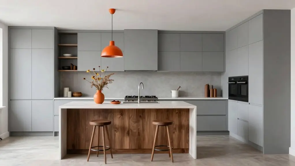
To use the 60-30-10 rule for kitchens, start by picking one dominant color for about 60% of the room—think cabinets or walls. That’s your calm, steady anchor.
Then, choose a secondary shade for 30% of the space, like an island or backsplash, to add contrast and depth. Finally, sprinkle in a 10% accent color through stools, towels, or a vase for personality.
It’s a simple blueprint that prevents visual chaos, and sticking with it means you’ll avoid mismatched surfaces. You’ve got the gist down, but there’s plenty more to fine-tune.
What Is the 60-30-10 Kitchen Rule?
The 60-30-10 kitchen rule is your secret weapon for pulling off a designer-worthy palette without the guesswork. It breaks your color scheme into three simple parts: 60% dominant color, 30% secondary shade, and 10% pop. Your cabinets take the lead at 60%, anchoring the room.
Then, you layer in 30% through your backsplash or countertops, adding depth and contrast. That leaves 10% for your accent color: think bar stools, pendant lights, or a funky range hood. This 60-30-10 rule creates a balanced color palette you can actually live with.
It coordinates all those tricky surfaces—tile, counters, floors—into one cohesive look. You’re not guessing; you’re choosing the perfect accent color to make your kitchen feel intentional and lively. For your 10% accent layer, pairing unlacquered brass with brushed nickel hardware gives your kitchen a collected-over-time look that feels elevated rather than matchy.
Seriously, it’s like having a cheat code for color confidence.
Why This Formula Works for Kitchen Design
You’re probably wondering why this 60-30-10 rule works so well, especially in a kitchen. It’s because your kitchen has lots of color “anchors”—cabinets, walls, countertops, backsplash, and flooring. Without a clear hierarchy, those surfaces can clash. The 60-30-10 rule solves that by giving you a foolproof structure.
Your dominant color takes up 60%, usually on cabinets or walls, and anchors the whole room. Then you use 30% for a secondary color, often through an island, backsplash tile, or lower cabinets. This creates depth without chaos. Finally, your accent colors fill that last 10%, think colorful stools, lighting, or decorative ceramics. They inject personality while keeping everything calm.
This formula cuts decision fatigue. Instead of guessing, you follow a big-to-small color workflow, so you never end up with mismatched finishes. For hardware, picking one consistent metal finish and matching it across cabinet pulls, faucets, and vent trim keeps your accent layer from feeling scattered. It’s simple because it works.
3 Real Kitchens That Nail the 60-30-10 Balance
Because these kitchens prove the rule works best in real life, let’s walk through three examples so you can see exactly how the 60-30-10 split plays out.
First, imagine light wood cabinets (60%) paired with a white backsplash (30%), then warm rattan accents and ceramics (10%)—totally grounded.
Second, picture deep navy cabinetry (60%) with neutral counters (30%) and a pop of yellow barstools (10%). That’s a brave, balanced statement.
Third, go airy with soft white walls (60%), a matte black island (30%), and bold dishes or a colorful range hood (10%).
Each kitchen color scheme nails this ratio: the dominant color fills your eye first, the neutral color supports it, and that fun 10% repeats just enough. You’ll spot the pattern instantly. Notice how in each example, the 10% accent color lands on functional accessories and textiles—this is intentional, since visual weight of accents can anchor a vignette and add symmetrical structure without disrupting the broader balance.
Identify Your Kitchen’s 60% Dominant Color
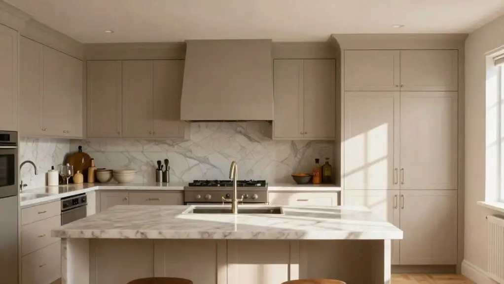
You’ll want to start by picking your 60% dominant color from the biggest surfaces in the room: think walls, cabinets, or the overall backdrop they create. In most kitchens, that means choosing a neutral base like light gray or off-white for your cabinetry, since it covers the most visual territory. Shades like soft greige or light putty work especially well here, as muted cabinet colors prevent small kitchens from feeling cramped.
Just make sure you test that shade in your kitchen’s real lighting. This way, your calming foundation doesn’t shift on you later.
Dominant Color as Backdrop
When you’re tackling the 60-30-10 rule in your kitchen, your dominant color acts as the calm, steady backdrop that holds everything together. Start with your cabinet finish; it anchors the room and sets the biggest chunk of your palette.
For the main wall color, try something like light gray, which reads as a peaceful foundation without shouting for attention. Remember, this backdrop guides your secondary color and accent choices, so pick a neutral like soft white, beige, or clay tones.
You’ll want to test how that paint looks in your kitchen’s actual lighting. Natural light can shift neutrals from warm to cool, messing with your contrast. Treat your backsplash and countertops as supporting layers, not competing backdrops.
When planning your backsplash as part of that dominant layer, always account for a 10–15% waste allowance before purchasing tile to avoid running short mid-project.
Get this 60% right, and the rest of your design falls into place with less fuss.
Choosing a Neutral Base
While it might sound a bit like paint math, the 60% rule for your kitchen is really about picking one solid neutral that does the heavy lifting.
This neutral base anchors your entire color scheme and makes everything feel coordinated, not chaotic.
You’re not just picking a color; you’re setting the stage for a calm, balanced space that’s easy on the eyes.
Here’s how to nail your neutral base:
- Choose a tone that works in all light – soft white, beige, light gray, or mushroom gray read well morning to night.
- Match temperature – if your cabinets are warm (wood or beige), pick a warm neutral to avoid a busy split.
- Anchor major surfaces – use your 60% on large countertops, backsplash fields, and big appliances.
- Treat it as a foundation – include large neutrals across walls, cabinets, and major trim for a unified look.
You’re building a backdrop that lets the rest of your kitchen shine without shouting. Pairing your neutral base with quartz countertops with bold veining adds visual interest without disrupting the calm, coordinated feel you’ve worked to establish.
Applying to Walls and Cabinets
Because your cabinets cover the most visual real estate, that’s where your 60% dominant color lives: it’s the big boss of your kitchen palette. You’ll want this color to feel calm and cohesive, so stick with soft neutrals like white, beige, or light gray.
Don’t forget, your wall colors join the party too. In smart kitchen design, treat both cabinets and walls as one unified backdrop for that 60% dominant color. This creates a grounded, spacious feel you’ll love living with.
For a 2025 twist, try soft beiges or mushroom grays instead of stark whites—they’re friendlier to the eye.
Pick your 60% first, then let your 30% secondary (like navy cabinets or a forest green island) and 10% accents fall into place naturally. You’ll avoid fighting styles and keep your kitchen balanced. Keeping your dominant color consistent across cabinets, walls, and even the backsplash creates a continuous visual plane that reduces harsh boundaries and makes a small kitchen feel noticeably larger.
Maximize Impact With Your 30% Secondary Color
You can create striking contrast by painting your kitchen island or lower cabinets in your 30% secondary color. This bold choice immediately draws the eye and turns a functional element into a focal point.
Just remember to limit this hue to one or two main zones. Letting your dominant 60% keep the space feeling open and calm. Similarly, applying the concept of batch cooking proteins and grains on Sundays can help you maintain that same intentional, zone-based thinking when organizing your kitchen’s workflow around the space you’ve designed.
Contrast Through Cabinetry
When you make your cabinetry the 30% secondary color, you instantly give the kitchen a sense of structure. Since cabinets cover so much wall space, they anchor your palette. If your 60% backdrop is light, go darker with your cabinets—navy, forest green, or matte black work beautifully. This prevents the room from feeling flat.
To maximize impact with your cabinetry, remember these four things:
- Choose a deeper secondary tone than your primary backdrop for instant contrast.
- Keep the same cabinet color on your island and main cabinetry so the 30% feels intentional.
- Vary both lightness and sheen; pair a neutral background with darker matte cabinets.
- Use your cabinetry as the bridge between your three colors. This lets your 10% accent pop without fighting the main look.
If you want warmth rather than drama, medium-toned wood stains on cabinets strike a balance between richness and airiness without overwhelming your primary backdrop color.
Accent Wall Possibilities
To give your 30% secondary color a real moment in the spotlight, try turning it into a single accent wall.
Pick a shade that contrasts your 60% neutrals without overpowering the room: deep navy or forest green works wonders.
Place it behind the range or on a breakfast nook wall so it anchors your kitchen visually.
If you’ve got a tile-to-ceiling backsplash, keep the accent wall continuous with matching mortar and grout, making your secondary color feel like one cohesive block.
Coordinate with your 10% pops: a navy wall supports yellow hardware beautifully.
Don’t stress strict percentages—just limit that big splash of color to one wall for balance.
For a warmer, more grounded feel, consider anchoring your accent wall with earth-tone brown shades through ceramic tile, which design experts say is replacing tired all-white kitchens in 2026.
You’re mastering color palettes and choosing colors for your kitchen that feel intentional, not messy.
That’s the sweet spot.
Use Your 10% Accent Color: Without Overdoing It
- Pick two to three spots. Cluster the accent on stools, a rug detail, and maybe a small vase. This ties the look together without shouting.
- Match it to your base. Choose a complementary or tonal accent, a warm metallic or deeper shade, from your 60% and 30% instead of adding a random bright.
- Keep it swappable. Use bold reds, greens, or yellows on textiles or small appliances you can easily replace. That way, you won’t regret it later.
- Do a quick count. If you spot more than a handful of accent-colored items, you’re likely over 10%.
Pull back to accessories only.
Common 60-30-10 Kitchen Mistakes to Avoid
Even if you’ve nailed your 60-30-10 ratio on paper, a few common slip-ups can still throw your whole kitchen off balance. Don’t overload the space with more than three main colors; stick close to that framework instead of chasing multiple competing hues that wreck your harmonious palette.
You’ll also want to check color flow between rooms. A correct ratio inside means nothing if an adjoining space clashes with your overall color scheme.
Never pick colors from a single swatch—natural light shifts undertones, so test samples in your kitchen’s actual lighting.
Never pick colors from a single swatch—natural light shifts undertones, so test samples in your kitchen’s actual lighting.
Don’t forget that cabinetry usually drives your 60% choice. Mismatching your backsplash or countertops with that primary decision breaks the rule fast.
Keep contrast intentional with distinct secondary and accent colors to add visual interest, avoiding a flat look even in tonal schemes.
5 Paint Color Palettes for 60-30-10 Kitchens
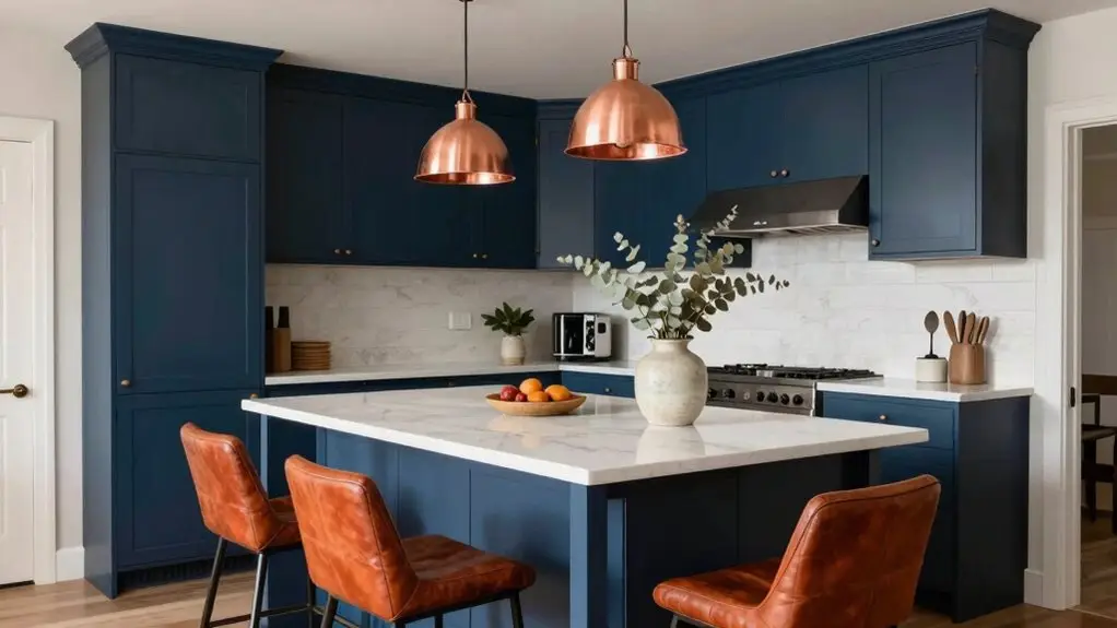
Once you’ve sidestepped those common color mishaps, it’s time to have some fun. You’ll build a balanced kitchen using your top 60-30-10 paint color palettes, where the 60% dominates, 30% supports contrast, and your pop of color takes center stage as the final 10%.
- Painter’s White (60%) + Secret Meadow (30%) + Gold Accents (10%)—Crisp white walls meet a deeper green on trim or countertops, while gold faucets and hardware add a touch of luxury.
- Nocturne Blue (60%) + Almond Wisp (30%) + Euphoric Magenta (10%)—Rich navy cabinets anchor the room, creamy almond balances them, and bold magenta accessories create a dramatic pop.
- Barnwood Gray (60%) + Smoky White (30%) + Warm Wood with Subtle Color (10%)—Gray serves as the easygoing backdrop. Smoky white appears on backsplashes or counters. Small wood details or decor add warmth.
- Very Navy (60%) + Patterned Neutral (30%) + Yellow-Orange Accents (10%)—Consistent navy provides a steady base. A patterned medium neutral adds depth, and sunny tones deliver a cheerful contrast without overwhelming you.
Final Thoughts
So there you have it. The 60-30-10 rule isn’t just for designers. It’s your new secret weapon for a kitchen that feels balanced, not chaotic.
Start with your dominant color, add that secondary shade for depth, and sprinkle in just enough accent to keep things fun without going overboard. You’ve got this.
Now go grab a paintbrush, break out the swatches, and make your kitchen look like it means business—with a little personality on the side.