The Best Fluffy Pancakes recipe you will fall in love with. Full of tips and tricks to help you make the best pancakes.


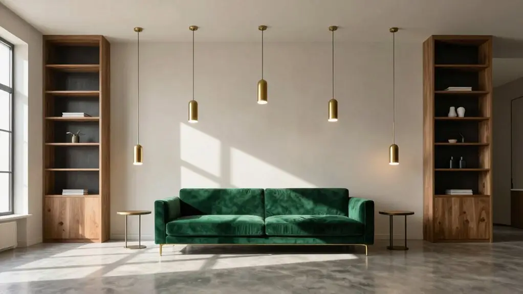
You’re probably wondering why some rooms just feel right while others feel like a furniture store exploded. The seven principles of interior design—balance, unity, rhythm, emphasis, scale, proportion, and contrast—are your secret weapons for creating spaces that actually work.
Balance keeps things visually stable through symmetry or clever asymmetry. Unity and rhythm tie everything together so your home feels like one cohesive story rather than a random collection of rooms. Emphasis gives your eye a place to land through focal points. Scale with proportion makes sure your sofa doesn’t look like it ate your living room.
Contrast adds energy through light, color, and texture without turning your space into a circus. Master these, and you’ll stop wandering into rooms that feel “off” without knowing why.
Balance: Symmetry, Asymmetry, and When to Break the Rules
Step into any room that just feels *right*, and you’re probably experiencing balance at work—even if you can’t quite put your finger on why. Balance sits proudly among the seven principles of interior design, anchoring spaces so they don’t feel lopsided or chaotic.
You’re working with three main flavors here. Symmetrical balance mirrors everything across a center line—think matching lamps flanking your bed, neat and tidy.
Asymmetrical balance gets trickier; you’re pairing different items with equal visual weight, like offsetting a bulky armchair with two slim side tables plus a bold plant.
Then there’s radial balance, where everything radiates from a single focal point—picture furniture circling a grand fireplace like respectful planets.
You’re juggling positive and negative space, scale and proportion, plus color and texture (yep, dark colors “weigh” more than light ones).
Here’s a fun secret: you can bend the rules. Keep that fireplace centered, then mix up what’s around it. Suddenly, your room feels alive, not stiff.
Even functional accessories contribute to visual balance—a rotating turntable organizer placed on a countertop or open shelf can anchor a vignette while adding symmetrical structure to the surrounding items.
Master these interior design principles, and you’ll stop wondering why some rooms just *work*.
Unity and Rhythm: Connecting Rooms Through Color and Repetition
Once you’ve got balance figured out, the next puzzle is making sure your rooms actually talk to each other. Otherwise, you’re left with a house that feels like a bunch of strangers at a party.
Balance solves one puzzle; unity solves the next. Without it, your rooms remain strangers at a party, never quite connecting.
Unity demands a consistent color palette threading each space together, while rhythm keeps your eye dancing through repetition.
Here’s how to nail it:
- Carry finishes like brushed brass tapware finish from kitchen to bath for instant cohesion.
- Echo material cues—matching woods, fabrics, or metals—so conveyances feel natural.
- Apply the 60-30-10 rule to anchor unity while letting accents create movement.
Mix pattern repetition with gradual scale shifts, and you’ll craft spaces that flow without getting boring. Your home becomes one story, not scattered chapters. For example, repeating a matte black finish across pendant lights and cabinet hardware creates the kind of deliberate finish and material continuity that ties a kitchen and dining space into a seamless whole.
Emphasis: Designing Focal Points That Actually Draw the Eye
Because a room without a focal point is like a story without a main character, your eye ends up wandering around, unsure where to settle. That’s why you need emphasis: you’re creating one clear spot where everything clicks.
You’ll build focal points with simple tricks.
An accent wall in a bold shade against a muted color palette does wonders.
You’re drawing attention fast when you’re using contrast that pops.
Don’t forget texture, either.
Rough stone or dimensional wallpaper feels closer visually, so your feature advances toward you.
But here’s the secret: you must balance that drama with negative space.
Keep surrounding areas quieter, with fewer competing patterns.
Group your furniture and lighting toward that focal point, and you’ve got a room that feels purposeful and pulled together.
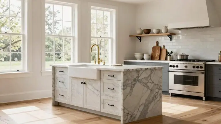
In kitchens, concentrating a statement backsplash pattern behind the stove creates a natural focal point without overwhelming the rest of the space.
Scale and Proportion: Why Your Sofa Looks Wrong (And How to Fix It)
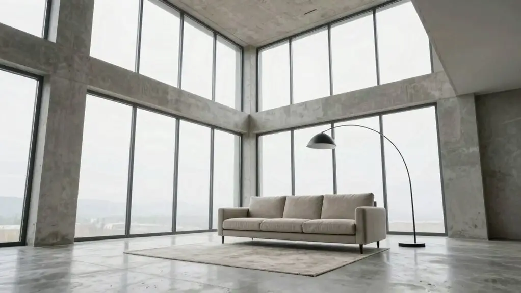
You’ve probably walked into a room and thought something feels off, even if you couldn’t name it. That’s usually a scale or proportion problem. Scale is how big your sofa looks compared to the room, while proportion is how its parts, like arms, cushions, and legs, relate to each other and to nearby furniture.
Getting these right, sometimes using the Golden Ratio as a loose guide, transforms a space from awkward to balanced without you moving a single wall. The same attention to detail applies to finishing touches like grout lines on tile floors, where using a penetrating impregnator sealer can preserve the natural look of surfaces without altering their appearance or proportion within the space.
Scale Vs. Proportion Defined
Why does that gorgeous sofa you fell in love with suddenly look like it’s eating your living room alive? You’ve probably mixed up scale and proportion, two tricksy cousins that can make or break your space.
Scale is your sofa’s relative size compared to the room itself. Too big, and you’ll lose positive space, functionality, and aesthetics. Proportion is how your sofa plays with neighbors like your coffee table; it’s all about visual weight harmony.
Here’s how to get it right:
- Run the rug fit test: slide that rug so your sofa’s front legs rest 6–8 inches on top, anchoring everything nicely.
- Match visual weights: pair a chunky sofa with a substantial coffee table, not a dinky one.
- Check your traffic flow. If you’re shimmying sideways, your scale’s off.
For precise sealing and finishing work around large furniture installations, a professional caulk gun kit gives you the control needed to create clean, polished edges along baseboards and trim.
Nail both, and your room breathes easy.
Golden Ratio Applications
Numbers can feel scary, but stick with me here. The Golden Ratio—about 1:1.618—is one of those sneaky helpful Principles of Interior Design that can save your space from disaster.
When your sofa looks wrong, it’s usually a proportion problem. Maybe you’ve got a tiny couch floating in a soaring living room, or a monster sectional eating your walkways. Either way, your space feel suffers.
The Golden Ratio helps you nail the right balance between different heights and dimensions so things don’t feel chaotic.
Let’s put this into action. Measure your sofa width against your wall width, aiming for roughly 61.8% and 38.2% splits instead of dead-center placement.
Apply this to focal objects too. A coffee table at about 61.8% of your sofa seat height often achieves a harmonious look.
Watch your walkways, though; maintain 30–36 inches so nothing feels cramped.
Play with the size of objects using this math, and you’ll transform rooms that feel “off” into spaces that just work. The same attention to proportion applies when adding features like a backsplash, where glossy ceramic tiles reflect light and create a polished, high-end appearance that enhances your room’s overall visual balance.
Fixing Furniture Placement
Although your sofa technically fits through the door, that doesn’t mean it works in your room, and that’s where most of us stumble with scale and proportion.
You’ve got to get the balance. Here’s how arranging elements work together to create a cohesive space:
- Size your coffee table to ⅔ your sofa length, leaving 14–18 inches for legroom and visual breathing room.
- Anchor your sofa to a focal point (fireplace, window, or TV) so the principle of emphasis kicks in. You’ll create emphasis naturally instead of floating furniture randomly.
- Leave ~36 inches for your traffic path, ensuring proportion feels intentional, not squeezed.
Match sofa heft to ceiling height so scale plays nice with the room’s volume.
A pantry organization cabinet system can also reinforce scale in an open-plan layout by grounding the kitchen zone with structured vertical storage that visually balances bulky living room furniture.
When these pieces click, you’ll feel the difference immediately.
Contrast: Using Light, Color, and Texture Without Overwhelming the Room
You’ve got to balance visual contrast like you’re seasoning a meal—enough to wake up the room, but not so much that you’re gasping for water.
When you apply contrast selectively, you’re basically choosing your battles: maybe one bold wall, a punchy backsplash, or a mix of sleek stone and cozy textiles.
While the rest chills out in the background, nail this, and your space feels alive without looking like it’s having a meltdown. For a low-commitment way to introduce contrast, peel-and-stick backsplash tiles like herringbone or marble-look options let you test bold patterns without permanent changes.
Balancing Visual Contrast
In tiled spaces, placing smaller tiles where natural light hits and larger tiles in shadowed areas uses scale and light contrast to naturally guide the eye through a room.
Applying Contrast Selectively
Selective contrast is your secret weapon: it’s how you add punch without giving your room a headache. You apply interior design principles by choosing just one or two hero areas, like a single accent wall or bold backsplash, so everything else stays calm.
Build contrast with light by pairing bright artificial lighting against deeper, warmer elements. Create color drama through light vs dark or warm and cool color pairings. Then anchor the space with the 60-30-10 rule: 60% dominant, 30% secondary, 10% accent.
Add texture contrast by mixing sleek finishes with tactile materials like linen or looped rugs. Repeat your contrasting choice across a few accent pieces to achieve unity. You’ll keep things lively without the chaos. For task areas like kitchen counters, under-cabinet strip lights with a high CRI rating ensure colors and textures read accurately under artificial light, reinforcing rather than muddying your contrast choices.
7 Design Elements That Make Principles Work in Practice
Once you understand the seven principles, the real fun starts when you put them into action. You bring principles and elements together by choosing interior design elements that actually work in your space.
Start by arranging objects in your room using three types of balance: symmetry, asymmetry, or radial, to get that visual stability.
Then, check your rhythm and emphasis. Repeat finishes to guide the eye, and pick one bold focal point so nothing fights for attention.
Use contrast wisely: pair warm with cool, or rough with sleek, but don’t go overboard. Follow the 60-30-10 rule to create a cohesive color story.
Add finishing touches like textiles, fixtures, and accessories to tie everything together. When elements of interior design click, your space feels intentional, not thrown together.
You’ve got this!
Common Principle Mistakes and How Designers Avoid Them
Even the best intentions can trip you up when you’re putting a room together. You might overload your space with too many contrast zones, turning it into a visual circus instead of letting one or two do the heavy lifting for real visual interest.
Or maybe you skip the focal point entirely, leaving your room feeling forgettable—yikes! You also forget that the principles of interior design need rhythm, so random decor just feels off.
Stick to the 60-30-10 rule with similar colors to keep things balanced and cohesive. Don’t blow scale and proportion either; that giant couch will eat your small room alive.
Learn from the pros, and your space will thank you.
Final Thoughts
Now you’ve got the seven principles in your back pocket, and honestly, you’re already thinking differently about your space, aren’t you? Balance, rhythm, emphasis, scale, contrast—they’re not rigid rules but tools that work for you.
So go ahead, rearrange that sofa, pick that bold color, trust your eye. Your home’s waiting to feel more like you, and you’re absolutely ready to make it happen.